|
Predictability |
  
|
|
Predictability |
|
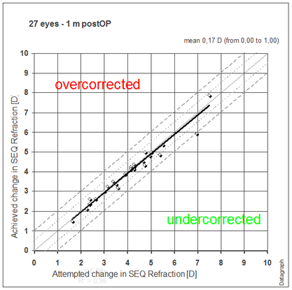
Looking at mean values alone will not tell you the true distribution of your results. Outliers to both sides may sum up perfectly but what counts for the patient is the risk of ending up over or undercorrected. The dashed lines indicted the ±0.5 and ± 1.0 D range.
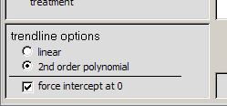
On the lower left area of the filter window you will find regression options for the trendline. Depending on the type and amount of data you may need to switch between linear or second order polynomial regression, forcing intercept at zero or not. If you are not sure which option to select keep it at 2nd order polynomial and intercept at 0.
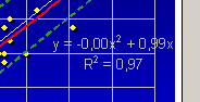
Most scatter graphs will display a regression formula and a regression coefficient of determination (R²). The numbers before the x² describe the nonlinearity ('curve') of the trendline. The slope of the data is given before the 'x'. The coefficient of determination 'R²' describes the quality of the 'fit' of the regression analysis. A value between 0.9 and 1.0 represents a good fit, otherwise your data is scattered significantly and is not well represented by the regression formula.